Isotope and Fancybox Galleries on Blogdown
 Photo by Harald Arlander on Unsplash
The Wowchemy theme (formerly Hugo Academic) can ‘tile’ irregularly shaped posts in a grid, using the Isotope Javascript library. In another post I describe how the ‘cascading card’ layout can be used in the Wowchemy’s pages widget (used for ‘posts’, ‘talks’ and ‘publications’). Wouldn’t it be nice to also use the Isotope library for galleries within a post?
Another Javascript library, fancybox can
also be used for photo galleries. When a picture has a data-fancybox attribute, then
clicking on that photo results in a ‘lightbox’ view of the photo. Photos with the
same data-fancybox attribute can be seen in the same lightbox by clicking on
the right/left arrows, or using cursor keys.
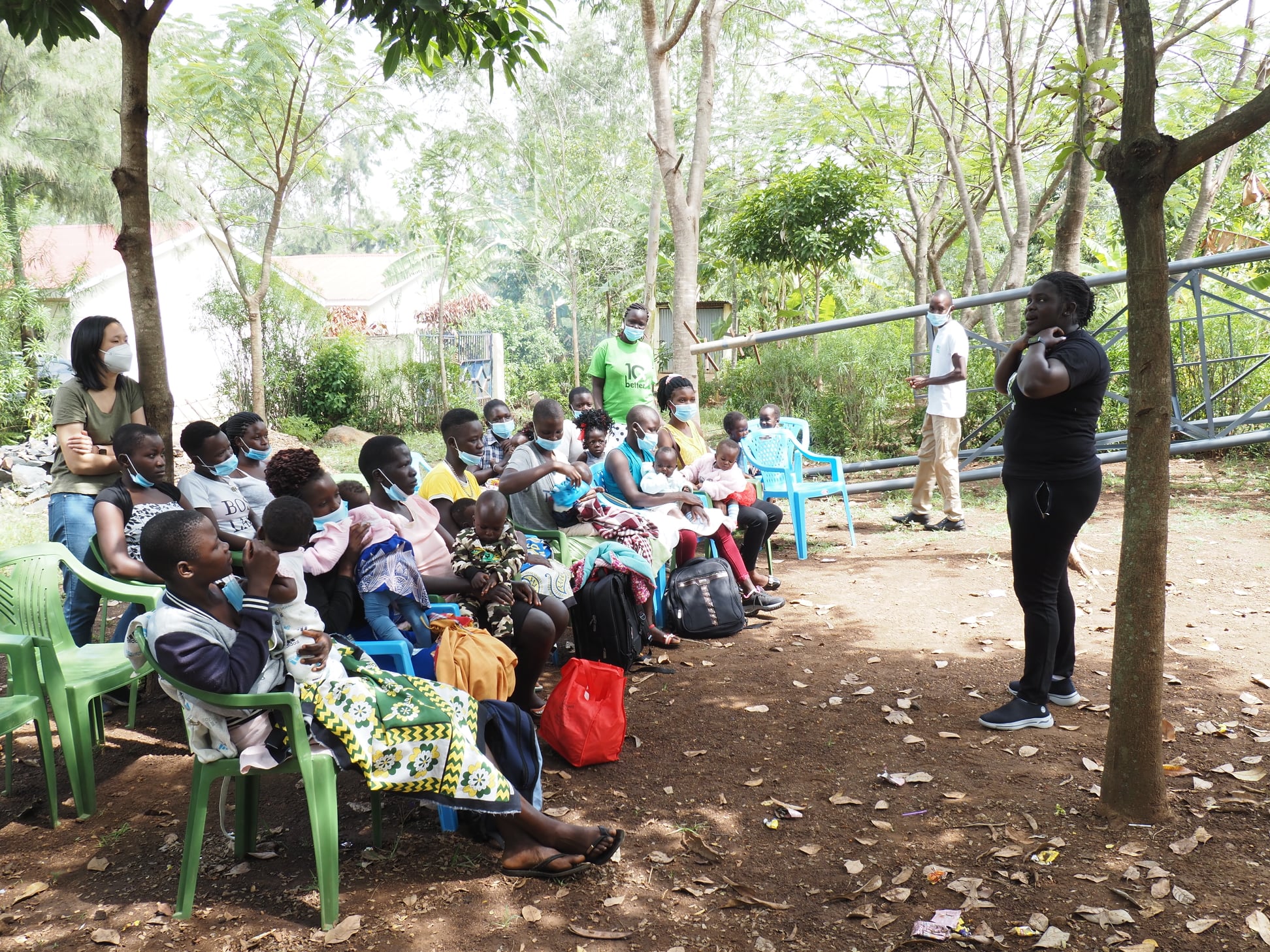
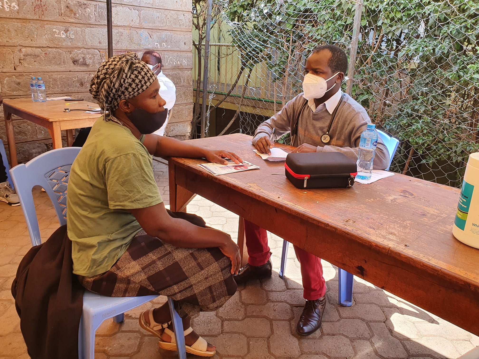
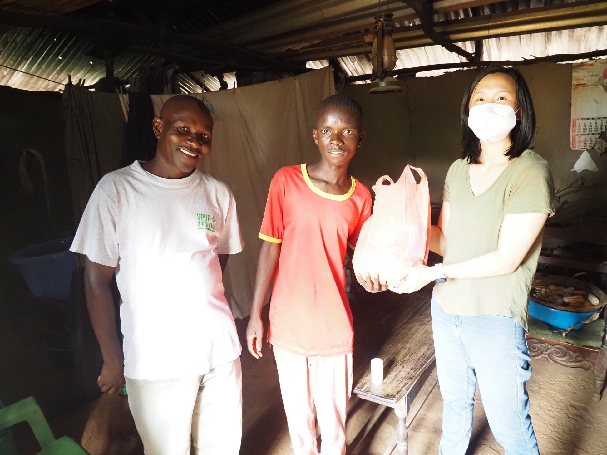
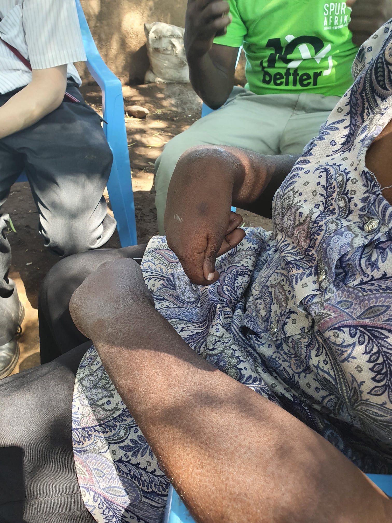
The example below is taken from my post on the topic of ‘equity’ after visiting
Kenya in 2021/2022. The code shown below is encased
in a ```{r} ... ``` code chunk.
htmltools::HTML(paste(
'<link
  rel="stylesheet"
  href="https://cdn.jsdelivr.net/npm/@fancyapps/ui/dist/fancybox.css"
/>', # for fancybox
'<script
    src="https://cdn.jsdelivr.net/npm/@fancyapps/ui@4.0/dist/fancybox.umd.js">
 </script>', # for fancybox
'<script
    src="https://unpkg.com/isotope-layout@3/dist/isotope.pkgd.min.js">
 </script>', # for isotope
'<div
   class="grid"
   data-isotope=\'{
     "itemSelector": ".isotope-grid-item",
     "masonry": "{\"columnWidth\": \".grid-sizer\"}",
     "percentPosition": "true",
     "gutter": 0
   }\'
 >',
'  <div id="grid-sizer"></div>',
'  <div class="isotope-grid-item" style="float:left; width: 48%">',
'    <a data-fancybox="gallery" href="./20220114_mothersandchildren.jpg">',
'      <img src="./20220114_mothersandchildren.jpg" style="margin:0px 0px">',
       # default CSS top/bottom margin is not zero
'    </a>',
'  </div>',
'  <div class="isotope-grid-item" style="float:left; width: 48%">',
'    <a data-fancybox="gallery" href="./20220114_consult.jpg">',
'      <img src="./20220114_consult.jpg" style="margin:0px 0px">',
'    </a>',
'  </div>',
'  <div class="isotope-grid-item" style="float:left; width: 53%">',
'    <a data-fancybox="gallery" href="./20220114_support.jpg">',
'      <img src="./20220114_support.jpg" style="margin:0px 0px">',
'    </a>',
'  </div>',
'  <div class="isotope-grid-item" style="float:left; width: 43%">',
'    <a data-fancybox="gallery" href="./20220114_disability.jpg">',
'      <img src="./20220114_disability.jpg" style="margin:0px 0px">',
'    </a>',
'  </div>',
'</div>',
#
'<br clear="left"><br>'
))
The first part defines the CSS of fancybox, and then includes the Javascript of
fancybox and isotope. isotope has already been include by Wowchemy, but it
is not clear to me how to access that included Javascript code.
In a div of class grid, the data-isotope attribute is defined. This attribute
needs to be rather carefully escaped.
itemSelectordefines how isotope grid items class will be named in divisions which contain gallery items. In this case, the class name will be defined asisotope-grid-item. Note the added.period at the beginning of the name when the class name is defined.the default layout is
masonry. Themasonryattribute is defined in thedivof classgrid. I’m not actually sure how to change to a different layout! Or whether changing themasonryattributes makes much difference!columnWidthin this case is defined as the width of the HTML element with theidofgrid-sizer. A period.is placed before theidname. By default, the column width is defined as the width of the first element in thegriddiv. Changing this attribute doesn’t seem to make any difference to me, but to keep things safe, the first element in thisgridwill be a full-width element with theidofgrid-sizer.percentPositionallows grid item widths to be defined as percentages of available width. This attribute appears to work. In the example, this attribute is set totruegutter, which borders thegridelements, in this example is set to zero (0)
As noted previously, it is safest to define the first element of the grid to be the full width of the desired gallery. As the width of the first element in the grid is the default width of the gallery.
Each element in the grid which is part of the gallery needs to have a class
definition which is the same as defined by itemSelector as mentioned above.
In the style attribute, the width can be defined as a percentage. The percentage
does not need to add up to 100%. Adjusting the percentages can help ‘line’ up the
rows to be of equal height.
The data-fancybox attribute in gallery items defines groups of photos as part
of the same lightbox display provided by fancybox.
In recent versions of hugo, the href and img src of
included pictures can be in the same directory as the post itself.
The images themselves do not have a default margin of zero pixels. Zero pixel
margins can be defined with the style attribute of the images.
David Fong
Lead doctor, Kensington site, coHealth
My interests include sustainable development in low-resource populations, teaching and the uses of monitoring and evaluation in clinical practice.